Film Chronicle
Bringing student filmmakers together
Website Redesign · Lead Product Designer · Spring 2021
Overview
This work felt personal. I grew up on movie sets with my dad doing camera work, so I felt invested to take these UX/UI designs to the next level using Figma.
The founders are young, humble film students on a mission to democratize their industry.
The website's vision was a stress-free way for students to submit films monthly, watch shorts, and network with aspiring filmmakers across the country.
Challenge
Their WordPress website had little to no visitors. Users expressed distrust in the platform and felt no urge to submit films to a site that lacked clarity.
My Role
I had complete autonomy as the only designer. My final deliverables included user and market research, brand identity redesign, a style guide, and an interactive high-fidelity Figma prototype.
Business Impact
The site is live today — receiving film submissions every month, and interest from sponsors and promotions.
Meeting Film Chronicle
1. Film Chronicle becomes the go-to source for all things related to student filmmakers.
2. Connect students from well-known to lesser-known schools across the country.
Business Goals
The founders asked to “beautify” the website UI.
After the research feedback session, we agreed the deliverables would expand to:
User Experience (watch & submit)
Brand Identity (icons, type, color)
Design Goals
Site Audit
Website UX/UI Audit
Research & Synthesis
User Interviews
Who am I designing for?
I wanted to define who would be using this site and what the future of Film Chronicle looked like.
Reaching out to family and friends who work on tv shows and movies, I was able to find 3 film students to user test and interview.
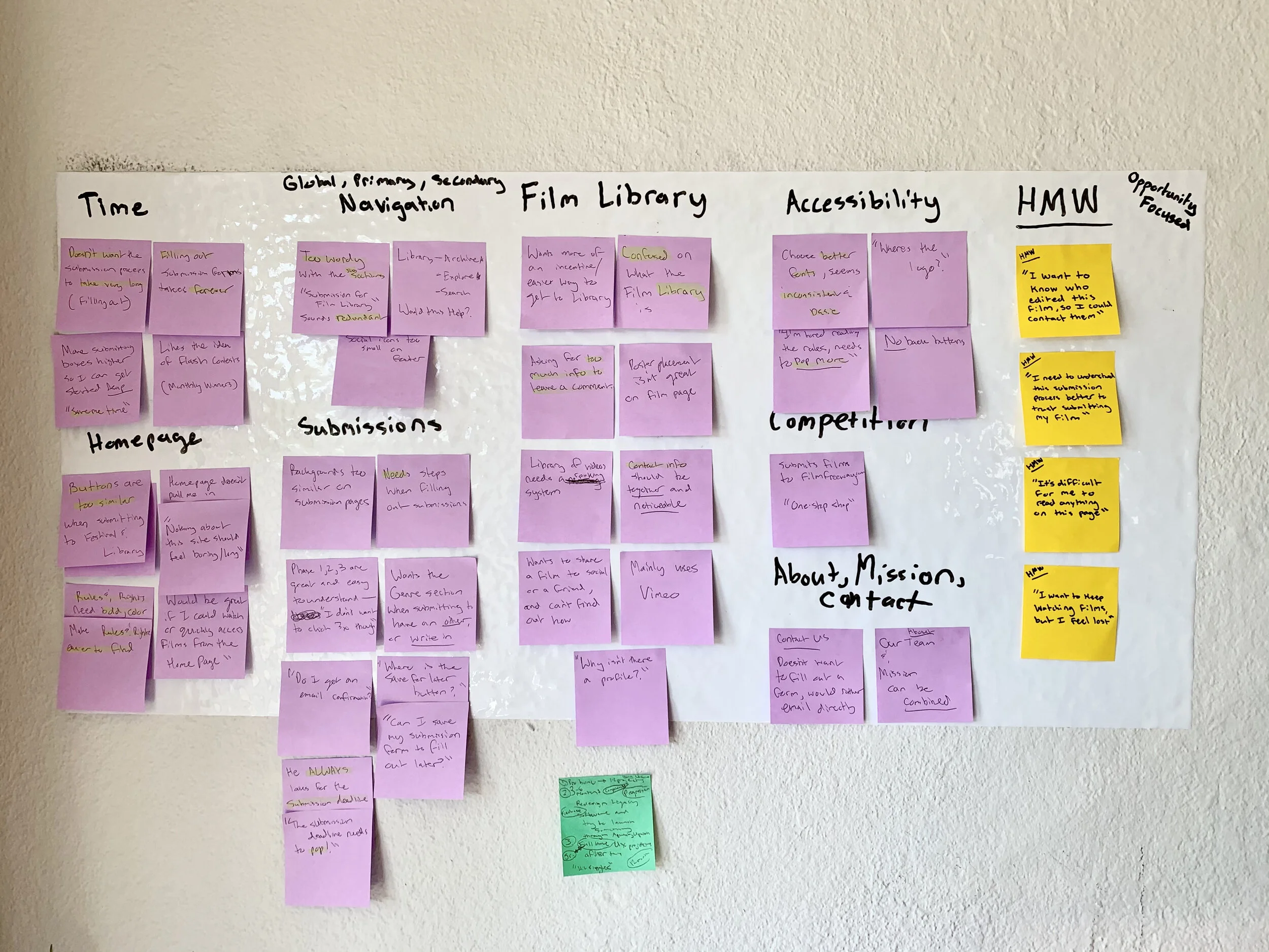
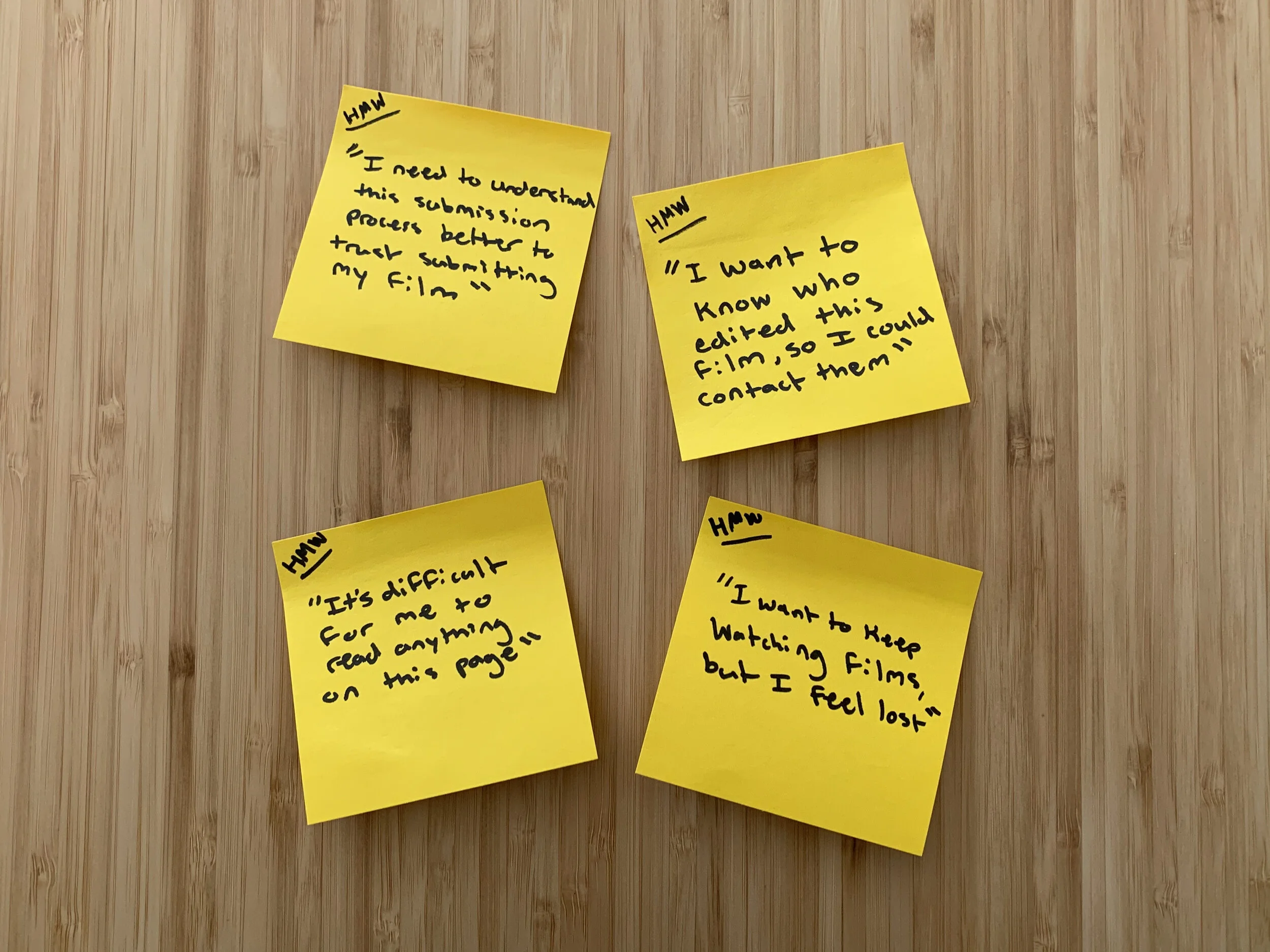
The goal was to turn their wants, needs, and frustrations into opportunity-focused “How Might We” statements.
Affinity map takeaways
“How Might We”:
Give students insight into who worked on a film
Decrease time filling out film submission forms
Improve filter system on film pages
Improve site readability and accessibility
Market Research
I conducted a competitive analysis of film websites students used. The students I interviewed showed interest in these three companies for various different reasons.
Understanding what these sites did best, common flaws, and the emotional grab was wanted to define.
Campus Movie Fest
Students felt enabled to participate in their festivals, because they offered exposure to sponsors, production companies, and, most importantly, potential film funding.
Short of the Week
Many filmmakers know this company. They don’t offer their own festivals. However, they offer a beautiful interface and experience to watch various films.
FilmFreeway
The #1 website filmmakers submit their films to. An easy submission process to every festival. It’s that simple. No experience to watch films - only submissions.
Design Process & Principles
What does my client want to communicate?
“For students to land on the website sensing professionalism with a hint of playfulness.”
Ideate, Test, Implement
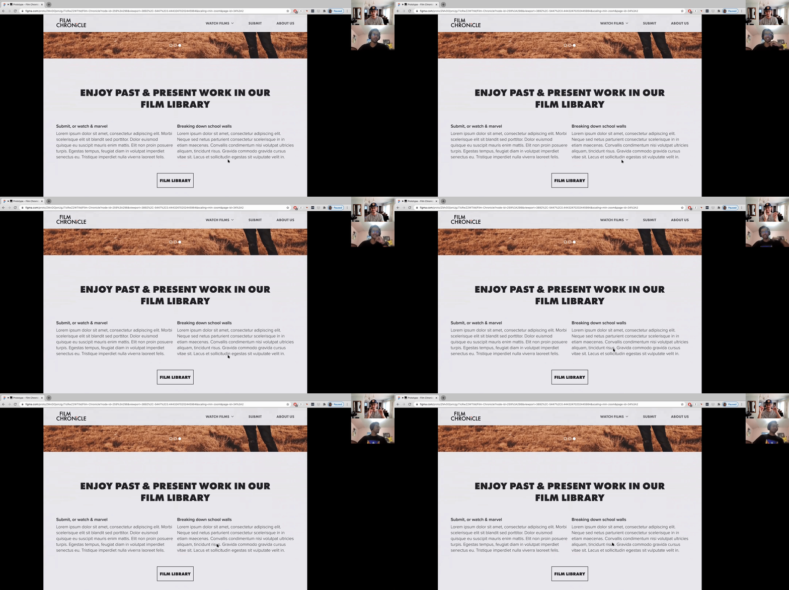
After testing the wireframes with students, I learned about the cons and introduced a few user flows.
Wireframes introduced
Grid Layout
Typography
Interactions/User Flows
Hi-fidelity introduced
Color Scheme
Components
Global/Secondary Navigation
Design Principles… Can’t forget ‘em
With the combined research, I followed a set of design principles.
Clarity
Self-explanatory UX/UI on what the user can do
Text, icons, and extras are accessibility
Metaphors
Design similar experiences filmmakers use on a daily basis
Remove any friction/uncomfortable learning situations
Intuitive
Students are unlikely to forget a negative experience
Always have a backup plan if problems arise
High-Fidelity Designs
Interactive Figma Prototype
The new website embraces data and trends, fueled by film students. No fluff. No pay-to-play.
The content is all coming from the collective talent of the film community. I designed the experience to let the films take the spotlight and show that Film Chronicle is the place to access them.
Results & Reflection
“You made Film Chronicle the go-to place for young filmmakers to be recognized. Absolutely beautiful!”
Sy Huq, Film Director
Let’s Reflect
What went well
Passion - designing for an industry you’re passionate about drives creativity
Accountability - being the only designer, I held myself to high standards
What could’ve been improved
Collaboration - there were moments I would have loved a design team to bounce ideas off
Digital vs. Analog - staring at a computer for hours stunts creativity


