Theme
Space, the Final Frontier - the finished product should be something that will enable users to learn, engage, &/or connect around the topic of space.
Outcome
Judges (Senior UX Designers & Developers) chose a winner based on final product designs, features, build, practicality, & presentation pitch.
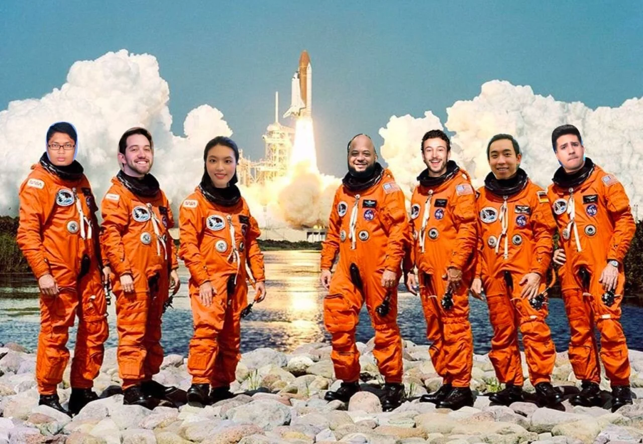
The project was selected 1st place among 34 teams. 🏆
My Role
Lead UX/UI Designer
Prototyping
Team
3 Designers
3 Developers
Tech Stack
Figma, After Effects, Miro, Bootstrap, React
T-minus 3… 2… 1… MVP Preview!
Day One
Meet the team, set expectations, and choose an idea
Aligning with Engineers on Product Vision
Hackathons can be a great opportunity to practice communication between designers and developers. Once teams were randomly assigned, I wanted everyone (including developers) to collaborate on a potential solution.
We chose a fitness app to help people stay fit during space travel. I came up with this idea, which put me in charge of managing the direction of the project.
We made sure the final decision was based on the judging requirements & feasibility
To quickly determine main features, we led an impact grid exercise asking relevant questions: Do we have experience using fitness apps? Has anyone built something similar in the past? Do we have the right tech stack and skillset?
A collaborative process weighing what features to design & develop
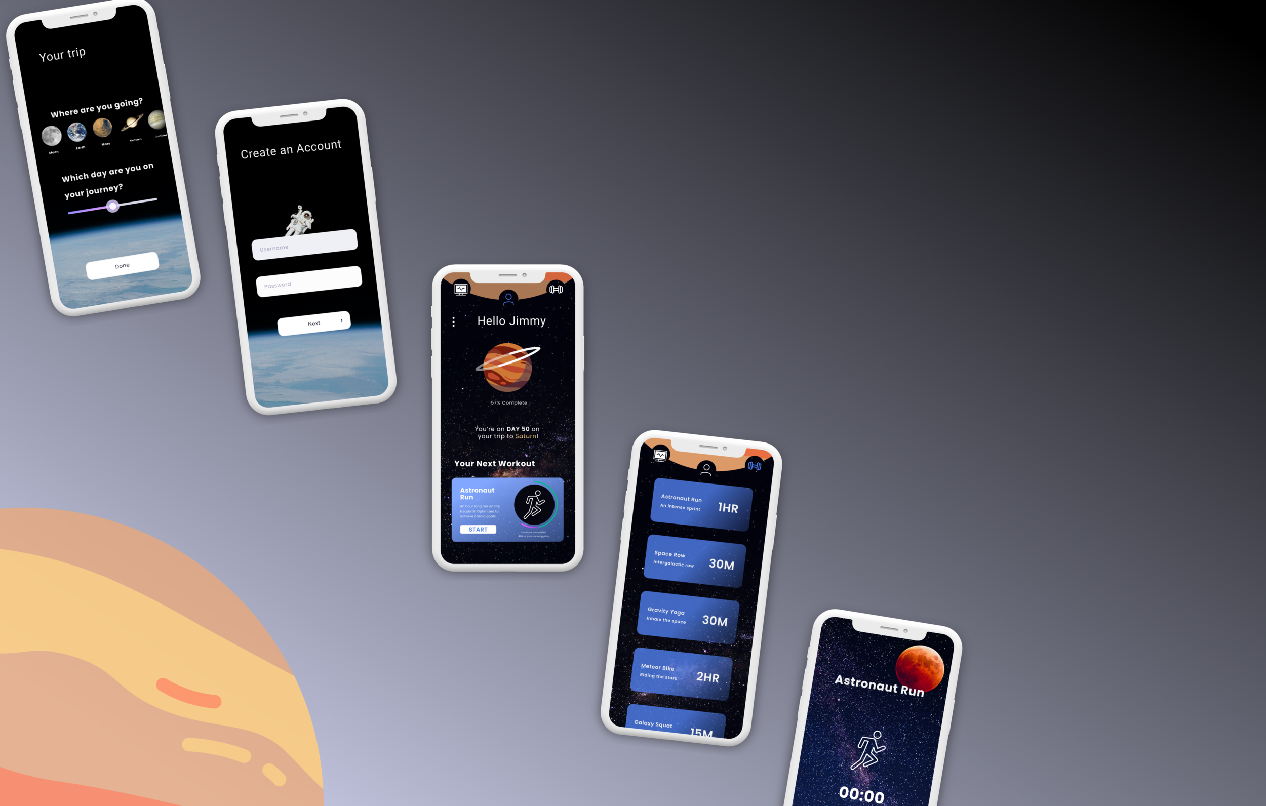
We agreed to build a Minimum Viable Product (MVP) including:
Onboarding System
Destination Details
Workout Library
Workout Timer
Astronauts Need to Exercise… A Lot
The first day was getting away from us and we knew interviewing astronauts wasn’t going to happen. I assigned tasks for each team member to uncover what effects space has on the body and why exercise matters in the cosmos.
The findings gave us a better understanding of the user & what design direction to take.
No Days Off
Due to zero-gravity environment, 🧑🚀 spend ~2 hrs per day working out.
Muscle Atrophy
💪 strength in space can decrease between 11% to 17%
Bone Loss
Astronaut risk losing 1% to 2% of their 🦴 mass every month traveling in space.
Heart Health
To maintain the work of the ❤️ at pre-space levels, you’ll need 90 min per day of aerobic exercise.
This validated the hypothesis that maintaining one’s fitness was a real need for space travelers, suggesting future demand for the product.
Who is our Space Traveler?
Since we were not able to interview astronauts due to time constraints, we discussed favorite characters from space-themed movies & tv shows.
Jimmy Neutron was the clear winner.
Problem Statement
Jimmy needs a way to exercise his muscles and bones in space flight, but he is lazy and finds it hard to work out 2 hours a day.
Solution Statement
Create an app that helps Jimmy stay motivated to exercise while he experiences the unique environment of space.
Day Two
Start the design phase with developers’ input
Product Strategy vs. Geeking out the Concept
With a fairly solid direction on a minimum viable product & a user with a real problem to solve, I recommended designers & developers participate in a design studio sketching for these main categories.
Onboarding
Straightforward approach for a user who wants to start their fitness journey while traveling the cosmos.
Homepage
Giving the user a central hub to quickly access anything in under 1 tap, and have the ability to peer into their fitness progress.
Workouts
Tailored to the user who doesn’t appreciate the extra fluff and unnecessary jargon that comes with most fitness apps in 2100.
Design Studio for the Future
The purpose of this exercise was to iterate screen designs at a rapid-fire pace while making sure the designs aligned with research findings & the developer’s workflow.
It was crucial having the developers on the Zoom call offering immediate feedback.
Onboarding Sketches
Round 1
(10 min) - Sketch as many versions
(5 min) - Present each screen & receive feedback
Round 2
(10 min) - Reiterate & sketch more versions
(5 min) - Present & vote
Round 3
(15 min) - Designer together, then move to next category
Lightspeed to Prototype
While the Design Studio was necessary, the process took a lot of time & attention. We knew we didn’t want to leave our fellow developers hanging while they waited for us to finish building the medium-fidelity versions in Figma.
Collectively, we agreed to expedite the process by skipping the wireframes & handing off the final lo-fi sketches & user flows for the three categories. The sketches were a blend of all the features and UI decisions we liked as a team.
Meet our beautiful Lo-Fi Sketchenstein created on the collaborative whiteboard software, Miro.
Creating a Design System to Scale
Since we divided the creation of the Hi-Fi Prototype, I suggested we create a design system on Figma in order to reflect consistency in our work, & to keep the developers in the loop about our elements. This allowed us to save time as we scaled the scope of this app.
Day Three
The designs come to life, and we win the competition
Launching the Designer’s Prototype
The goal was to provide future generations of space travelers with a tool to educate, exercise, & motivate them to stay fit while enduring the challenges of intergalactic flight.
Onboarding ☄️
An educational step-by-step process that builds a specific fitness plan for your space travel needs.
NASA astronauts have spoken out about their experience dealing with the loss of bone density & muscle mass, unless countermeasures are taken.
While time in space takes a toll on the body, we believe the user should choose a trip destination to stay up-to-date while completing their space journey & exercise plan.
Homepage 🪐
Our user lives a sedentary life, which we can safely predict will continue while traveling through space.
After onboarding, users have no time to waste if they want to quickly begin a workout.
The homepage layout was designed to choose an option in under 3 taps.
We overachieved this goal by having our future space traveler start a workout in 1 tap.
Workout 👟
If users feel motivated to try another exercise routine, they will always have a clear path from the homepage.
Only takes 2 taps to browse the workout library and start a new workout.
An array of exercise options listed with a short description, workout length, & glowing UI to choose correctly.
Activity Tracking 🛰
Users are smart enough to know the best way to adopt a new habit is by actively tracking progress towards their goal.
Direct access to your weekly workout progress to stay informed
1 tap into the activity to pick up where the user was in the exercise.
Landing the Developer’s MVP
Onboarding Flow
Homepage, Workouts, & Activity Pages
Still curious? View the Figma prototype & Developer MVP
Let’s Reflect
This was my first experience participating in a hackathon & deploying a functional prototype in under 3-days. Let’s dissect what went into winning the hackathon & understand what we could have done better.
Why we won
Came prepared - knowing the theme a day before was an opportunity to research the topic, generate ideas, & learn how other hackathons were won.
Listened to everyone - including developers in the early stages of ideation fostered teamwork, direction, & alignment to know what was feasible during the short sprint.
Prepared a story - coming from my sales experience I’ve heard hundreds of pitches & the best ones always sway the audience through emotional storytelling.
What could’ve been improved
Proper handoff - understanding how long it takes for a developer to build a certain feature can make workflows run much smoother.
Articulating designs - communicating design decisions was a struggle at times & in hindsight, we could’ve sped up certain processes if we had better tactics to express our thinking.
Always keep the end-user top of mind when explaining design decisions
No matter what finish design deliverables asked by the developers on time
Join the developers - I did a great job including developers in the design process that I never spent time on their call while they wrote code.
Moving forward I can’t wait to involve myself more in the technical iteration process
