Sleeper
Fantasy Sports App
Research & Redesigns · Product Designer · Summer 2021
Overview
Sleeper has become the fastest organically growing fantasy platform in the world focused on bringing people together through sports and gaming.
In 2021, not only had the company more than doubled its user base, exceeding 3 million active users, but it now also boasts a top-50 user retention ranking in the app store.
-
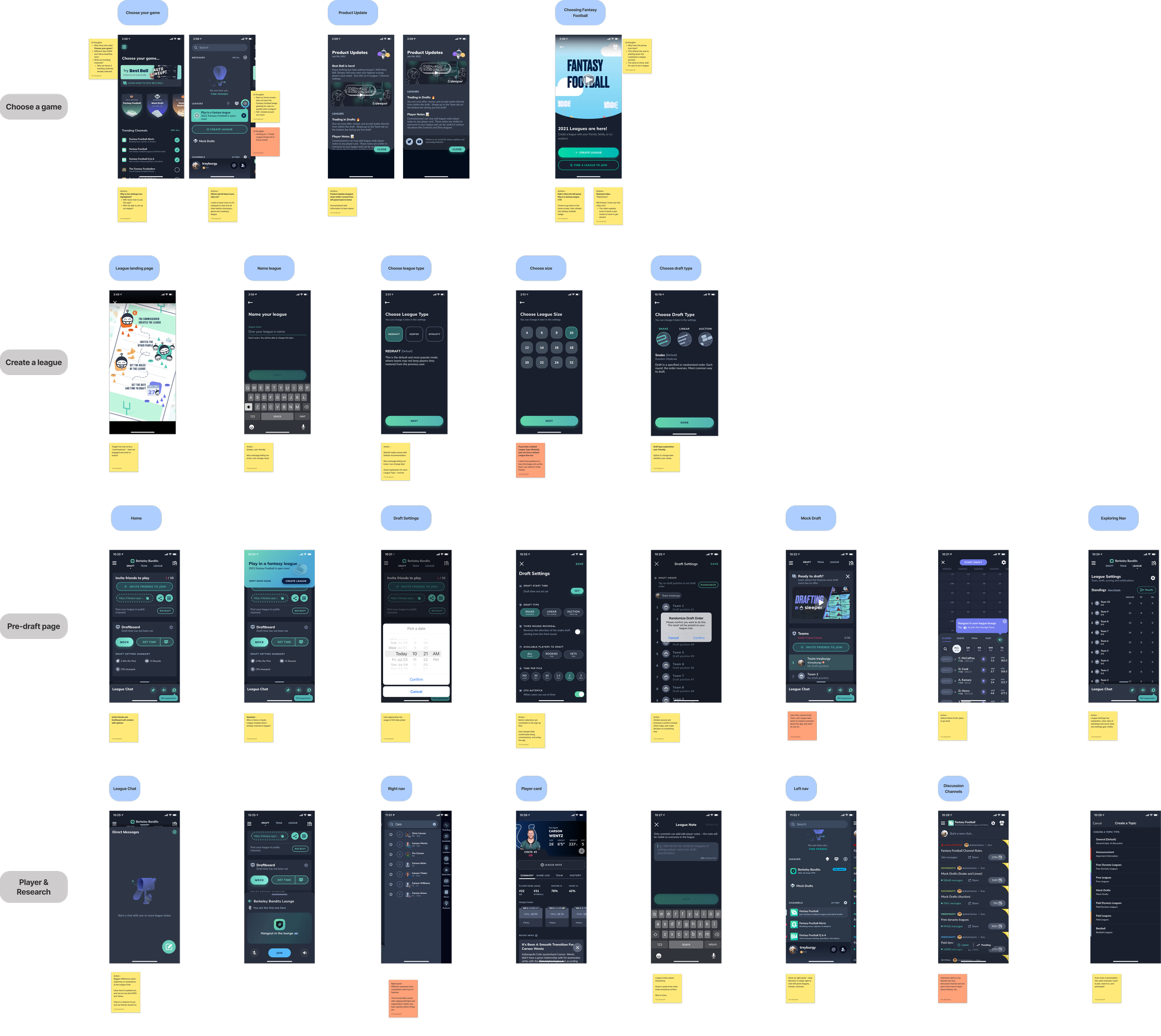
I audited the current app's onboarding experience for first-time users while comparing competitor offerings.
-
I personally challenged myself to increase league creations with in-app designs prior to the 2021 NFL Season.
-
To better understand the current users’ wants, needs, & pain points, the product design interns & I collected data from over 100 users on Reddit.
-
I streamlined the onboarding & pre-draft experience for a newbie to experienced users.
-
Collaborated with a senior product designer & an artist to redesign the player card's UX & UI
My Role
As a product designer, I collaborated cross-functionally with senior designers, artists, engineers, and leadership on various research and design projects to prepare for the NFL 2021 season. I also participated in ideation sessions to improve the NBA fantasy basketball experience.
Dream Internship
🏆
Dream Internship 🏆
App Critique
Identifying opportunities to solve
At Sleeper, we practiced iterative UX design cycles for each project. The goal is to gather the right information to make the best product.
To break up user flows to audit, I designed a simplified journey map. I learned what potential touchpoints, frustrations, and opportunities to improve during my internship.
This critique kickstarted my deep understanding of the product & users I would be designing. I presented questions, problems, and suggestions to the team (few slides below).
New User Onboarding Flow
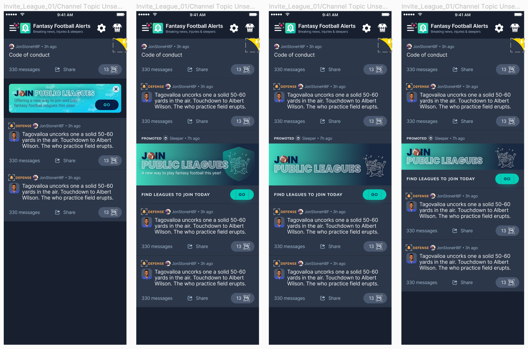
NFL In-App Promotions
Increasing leagues created
I am a big-time fantasy sports fan and with the NFL season approaching, I saw an opportunity.
I reached out to the data team to find a business and/or user problem to solve during my summer internship.
I learned the user acquisition window for fantasy football leagues is highest from the 2nd week of August until the 1st week of September. Historically, ~70% of users create their leagues in that three-week window.
It was the end of July, so I needed to move quickly to decide what I was going to design and where I was going to execute the new designs to increase the league’s created conversion.
Shipped Designs
Without hesitation, I presented my to collaborate with me on identifying promo placement.
More data came in & I learned that ~20% of Sleeper users only open the app to view the community channels (similar concept to Reddit forums). The 20% use channels to stay informed, post, and comment about recent player news without having a league on Sleeper. That’s a major problem because users aren’t experiencing the full Sleeper fantasy sports experience.
Bingo - I found the perfect place (community channels) & target audience to design for.
Business Impact
When the NFL season started in September, the data team reported a 5% increase in leagues created through the community channel promotions.
Pre-Draft Experience
Learning about the users
Sleeper takes insights from the massive fantasy football Reddit community. With 958k members on r/fantasyfootball, there is constant communication on what users like, dislike, want more of, or less of, and the product team listens and engages.
To reach a wider user base for a UX research survey, I gathered ~100 Sleeper users on Reddit to take a brief survey. The insights below helped me discover and define my pre-draft design project.
How would you describe your experience level using Sleeper?
Observation
Most users are new or casual to Sleeper
Question
What makes a user casual vs. new or experienced?
Opportunities
How might we design a better experience for new and casual users to become experts?
Which Sleeper feature helped you learn how to play?
Observation
Users are willing to read descriptions and instructions
Question
What descriptions and instructions are users referring to?
Opportunities
How might we design educational content to help users better understand fantasy sports?
Benchmarking existing UX patterns
The senior designers found new users faced an idle problem between a league created & their fantasy sports draft day - the pre-draft window. This could last a few days to weeks, causing new users to drop out.
We kicked off this project by benchmarking other competitors & comparative apps to better understand how to conceptualize design ideas.
Pokemon Go, Discord, & Duolingo
Insights discovered
Users may not know what each feature/tab does on the pre-draft page
Users want interactive guidance rather than just reading instructions
New & experienced users need a way to exit an onboarding experience
We collectively explored sketches based on research & what’s possible with the design system.
Executing high-fidelity flows
The final pre-draft designs are confidential since they are still in production and I signed an NDA.
Please reach out and I’d be happy to walk you through the experience.
Player Card Hackathon
Some friendly competition
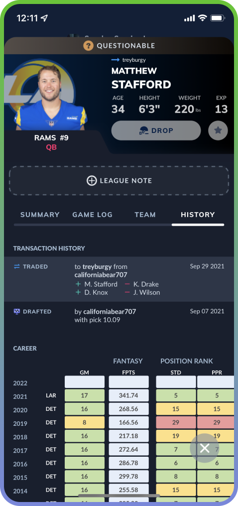
The player card is the keystone of the fantasy sports experience. Users bounce from one card to the next evaluating what players to start, drop, and trade based on a wide range of factors.
This part of the Sleeper experience needed a design update to keep users engaged and to compete with the changes ESPN and Yahoo were making.
How might we put a little pressure on redesigning the player card? 3-day hackathon!
Current Player Card
Brainstorming what problems to solve
Teams were broken up into 2 designers and an artist. The ask was to design something new-age, groundbreaking yet with clarity, consistency, and the end users in mind.
Player card must-haves
Game Log (recent, past)
Recent News
Player Actions (trade, add/drop)
Player Rankings/Stats
Team Depth Chart
New features to introduce
Accessible Navigation
In-Depth Injury History
Modern, Gamified UI
Start exploring ideas
With the action plan set on what to improve and introduce, we conducted market research.
A few examples were video game sports player cards, how the medical industry visualizes injuries, and what mobile accessibility navigation patterns exist that assist with physical movement.
NBA 2K Player Cards
Medical History Reports
iOS AssistiveTouch
Executing chosen ideas
With benchmarking complete, we set the timer and sketched how our ideas would integrate into the current Sleeper player card design.
Accessibility (color, sizing) has been an issue at Sleeper so NBA 2K inspired us to implement better data design patterns such as the attribute meter.
With so many NFL players affected by injury year to year, we knew the health report would give users an extra layer to draft, start, or trade a player.
My team was most excited about the potential of the new navigation inspired by AssistiveTouch.
💥 Fresh, new player cards 💥
There was no actual winner in this hackathon, but a promise few of each team’s designs would be placed into their features backlog to be worked on in the future.
The player health report was ranked by the design leaders as one of the best features.
Results & Reflection
Let’s Reflect
What went well
User-centered design philosophy - Purposefully human, enjoyable, and personal
Immediate impact - being a fantasy sports user on ESPN and Yahooo, I knew trending features that could give Sleeper an extra edge to retain and acquire new users
What could’ve been improved
Patience - as an intern, you have an eagerness to prove yourself right away
Not designing for myself - making decisions based on data, not gut-feeling


